Dan Knight - 2001.12.12
We've run three opinion surveys asking your opinion of various Mac-related websites. Looking at the results, I seemed to see a trend - for the most part, sites that received more votes also ended up with higher scores. Time to create some charts.
I first created an X-Y scatter chart of the recent Best of the Mac Web survey results in AppleWorks. The horizontal axis is the number of votes; the vertical access is the site's score on a scale of 1-5 (unacceptable to excellent). Here's what that chart looks like:
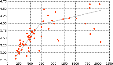
I added the gray trend line by eye to show the rough correlation between how well known a site is (number of votes) and how well respected it is (the score on the vertical axis). The better known, less highly rated sites tend to be rumor and magazine-related sites.
This raises the question: Is this a normal pattern or a fluke? So I charted the results for the Rest of the Mac Web survey:
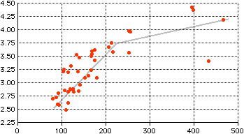
We see a similar pattern here: the less votes a site receives, implying it is less well known, the lower its score. The better known the site, the higher the score tends to be.
Finally, I went back to the original BOTMW survey from April 2001.
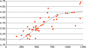
This survey didn't include rumor sites, but this chart exhibits the same kind of pattern as the other two charts. In all three cases, the trend line is similar - a steeper line at lower vote counts and a flatter line as the vote count increases. The true shape would be a curve, but if AppleWorks can create one, I haven't figured out how.
What these results show is a correlation between how many votes a site received and how well viewers rate the site. That raises the question: Does a site receive a higher rating because it's better known, or is a site better known because it's more highly respected?
My guess is that the better a site is, the more likely other sites are to link to it and visitors are to recommend it. Instead of a "chicken or egg" question, maybe it's more like the way cream rises to the top.