Low End Mac's Online Tech Journal
Pixels and Points, Screens and Paper
Dan Knight - 2003.02.06Once upon a time there was absolutely no correspondence between how text appeared on the computer screen and how it looked when you printed it out.
In the early days, you might write on a display 32 or 40 characters wide, while your printer would print 10 or 12 characters per inch over 7" to 8" of paper. If your printer supported bold, italic, underlined, or wide text, that was cool - but you couldn't see it on the computer screen.
Before GUIs, one of the big advances in computer design was monitors that could display underlined, bold, and sometimes even italic type on the screen. And even though daisywheel printers supported proportional fonts, computer screens didn't.
Word processing was anything but WYSIWYG.
Then came Apple's Lisa, which was
very, very different. It had a graphical user display and 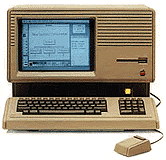 simulated
the appearance of black text on a white page. The 12" display was 720
pixels wide and 364 pixels high, almost exactly the same as the
monochrome graphics standard in use on PCs (720 x 350).
simulated
the appearance of black text on a white page. The 12" display was 720
pixels wide and 364 pixels high, almost exactly the same as the
monochrome graphics standard in use on PCs (720 x 350).
Pixels
A pixel is a single dot on the computer screen. Palms have tiny screens just 160 pixels on a side, and GameBoys have 160 x 144 pixel displays. A lot of early computers displayed 320 pixels horizontally and 200 vertically, which was about the most a television or color monitor could display in the 1970s.
Until 1984, pixels tended to be rectangular. The typical monitor has a 4:3 aspect ratio, which is one reason for the 640 x 480 VGA and 800 x 600 SVGA standards, but early computers were generally designed for lower resolution display devices, and their designers didn't seem concerned about square pixels.
Enter the Macintosh, which may have been the first computer explicitly designed to use square pixels. Calculating the display of lines on the screen was a lot simpler with square pixels, and the PC side of the industry followed Apple's example with VGA in 1987. (The earlier Lisa used rectangular pixels that were 50% taller than the were wide.)
Points
In the world of publishing and printing, type has been measured in units such as points, picas, Ciceros, Didot points, inches, and who knows how many other units. (See Difference between Point Systems for some of this history.) Each of these corresponded to a physical size of printed text on paper.
Until the Lisa came along, there was no correspondence with what you
saw on a personal computer 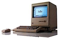 screen and
what you got on paper. And the Macintosh went a step further, using
square pixels which corresponded precisely to the typographer's
points.
screen and
what you got on paper. And the Macintosh went a step further, using
square pixels which corresponded precisely to the typographer's
points.
Screens
Whether through deliberate design or fortuitous coincidence, the early Macs with their 9" b&w displays worked at almost exactly 72 dots per inch, the very same number that defines a point in Anglo-Saxon typography.
The display width of the Mac screen (512 x 342 pixels) corresponded very nicely to the width of a line of type on standard office paper (512 / 72 = 7.1") with a 3/4" margin down each side, and the Mac's GUI let you see your fonts as they would appear on paper.
Apple's ImageWriter and ImageWriter II printers helped facilitate this, since they also printed by default at 72 dots per inch (or 144 dpi in quality mode). What you saw on the screen was what you got on your printer - and it was also what you got from your typesetter.
It should be no surprise that when Aldus PageMaker arrived for the Mac, the publishing industry got very excited. At the time, most typesetting equipment was still text based - not what you see is what you get (WYSIWYG) like the Mac. Instead of simply specifying type for repro, publishers could design entire pages and eliminate the tedium of manual paste-up with was, repro, drafting pens, Xacto knives, transfer type, and all the other tools we used.
WYSIWYG
I worked in the world of manual design. I also worked in the world of computerized page design. There's no question which is superior, nor any question why PageMaker (and later Quark Xpress) made the Mac the norm in the publishing industry.
At first Apple tried to stick with the 72 dpi display of the original Mac. Their portrait display showed a vertical page of 640 x 870 pixels at 80 dpi, and their monstrous 21" Two-Page Display showed 1152 x 870 pixels at 77 dpi - each departing somewhat from the idealized 72 dpi of the b&w Macs.
Things went the other way with early color displays. Apple's 13" Color Display showed 640 x 480 pixels at 69 dpi, and the later 16" Color Display ran at 832 x 624 with 70 dots per inch.
Then came multisync monitors, which could change resolution on the fly. Even if your display corresponded to 72 dpi (more or less) at one resolution, that correspondence vanished when you switched to a higher or lower resolution.
For purists, any deviation from a 1:1 correspondence between the size displayed on the screen and the size of an item on paper is an affront to the WYSIWYG ideal, as though the correspondence between the screen and paper should be precisely physical, not merely visual.
Does It Matter?
When you're playing with the Sims, instant messaging, handling email, browsing the Web, writing a memo, calculating a spreadsheet, or designing pages for the Web, it really doesn't matter if there's an exact physical correspondence between the size of type or a graphic on your screen and the size at which is may print.
Apple knows this and accepts the reality. It that weren't the case, the 1024 x 768 display on the iBook would make the screen 14.22" wide and 10.67" high - and the whole computer is a lot smaller than that. (Apple's new 20" Cinema Display would have to have an LCD 23.3" wide and 14.6" high, making it a 27.5" display when measured on the diagonal.)
Even print designers generally work around the apparent disparity between true WYSIWYG and the computer display. We sometimes work at the 100% setting in Quark, but when I did book design, I generally found 120-125% made it much easier to read the 9-12 point type commonly used in book design. And sometimes you would zoom in further to tweak a section of the page, just as sometimes we used a magnifying glass in the days of manual design and paste-up.
It Does Matter
Strict WYSIWYG isn't generally important, but understanding the difference between the display and the printed page is.
Imagine you want to design 8.5" x 11" books or magazines and work in two-page spreads, which is not an uncommon need in publishing. Logic tells you that your monitor should display a 17" width and 11" height as a minimum. The math (Pythagorean Theorem: The square root of 172 [289] plus 112 [121] is 20.25 [Ì410]) is simple - you need at least a 21" monitor to display both pages, and that doesn't even include room for the menu bar or your tools.
| Display | DPI |
| 23" Cinema Display | 98.4 |
| 20" Cinema Display | 98.4 |
| 17" Studio Display | 96.2 |
| 17" G4 iMac/PB G4 | 100 |
| 15" PB G4 (1280 x 854) | 101.4 |
| 15" PB G4 (1152 x 768) | 91.1 |
| 14" iBook | 91.1 |
| 12" iBook/PB (1024 x 768) | 106 |
| 15" G4 iMac | 97 ? |
Nor does Apple make it easy on you - they no longer specify dots per inch for their new displays, so you have to do the math to convert from their pixel pitch in mm to dots per inch. (In several instances, I had to find sources other than Apple for this information.)
As the chart on the right shows, Apple has completely abandoned the 72 dpi ideal of the early Macs, moving closer to the 96 dpi standard of the rest of the computing world. And that's part of the reason Aqua looks so big on older Mac display - it's designed for the new reality, not the 72 dpi of old.
We're moving away from a 1:1 correspondence between pixels and points on the printed page. In the end that means on screen type composed of more dots, which will make text that much easier to read, among other things. (It also represents one of the few times Apple has followed Microsoft's lead. Windows has been designed around 96 dpi for ages.)
If actual size WYSIWYG display is crucial, you'll want to know these numbers. If you're willing to live with a display that visually corresponds to the printed page without an exact 1:1 correspondence, it's still helpful to know the difference between screen resolution in pixels, dots per inch, and how things will show up on the printed page.
It's an important distinction, especially if you're ever helping someone spec out a desktop publishing system. For laying out spreads of 8.5" x 11" pages, you really don't want anything less than Apple's new 20" Cinema Display. That's the new reality.
I'm willing to live with that. But can you imagine how hard (and costly!) it would be to design a poster or billboard if we insisted on a 1:1 correspondence between the display and the final output?
Join us on Facebook, follow us on Twitter or Google+, or subscribe to our RSS news feed
Today's Links
- Mac of the Day: Performa 550, introduced 1993.10.18. The color all-in-one Mac reaches 33 MHz.
- Support Low End Mac
Recent Content
About LEM Support Usage Privacy Contact
Follow Low End Mac on Twitter
Join Low End Mac on Facebook
Favorite Sites
MacSurfer
Cult of Mac
Shrine of Apple
MacInTouch
MyAppleMenu
InfoMac
The Mac Observer
Accelerate Your Mac
RetroMacCast
The Vintage Mac Museum
Deal Brothers
DealMac
Mac2Sell
Mac Driver Museum
JAG's House
System 6 Heaven
System 7 Today
the pickle's Low-End Mac FAQ
Affiliates
Amazon.com
The iTunes Store
PC Connection Express
Macgo Blu-ray Player
Parallels Desktop for Mac
eBay
![]()
