
1998: Paradigm is a buzzword of the 90s. A paradigm is a mental picture, a way of thinking of things. Significant changes take place when we think outside the box or shift our paradigm. This is what Apple was talking about with the Think Different campaign.
The first computing paradigm was one computer running one program at a time, most of think programs that involved working with a lot of numbers.
The first paradigm shift was from hard-wired computer programs to programs you could load from cards or tape. That’s like the difference between ROM-based systems (such as game machines) and “real” computers with RAM and disk drives.
A later paradigm shift was to run more than one program at the same time. While we debate the benefits of different kinds of multitasking today, this is the dominant paradigm on computers. Every major OS is designed to handle several programs at the same time.
Another paradigm shift extended the idea to several users running different programs at the same time, giving birth to multi-user and time-shared computers. That idea has had little impact in the PC world, where the paradigm is one user, at least one computer.
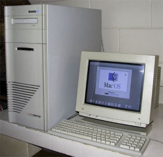 The next paradigm shift may well be from the single-processor computer to machines with multiple processors. These are already making inroads on servers and with heavy Photoshop users (for instance, the dual- and quad-processor DayStar Genesis machines, since each processor can do part of the task, allowing more to be done at once.
One real advantage of a multiprocessor computer would be allowing keyboard input no matter how busy the computer is – one processor would always make I/O a top priority. That’s something we can all look forward to.
Thinking Different About Monitors
Apple brought the paradigms of the graphical user interface and direct manipulation (via the mouse) to the public. The original Macintosh and all the others that used the same 9″ screen showed information at 72 dots per inch (dpi).* This number was convenient in several ways.
- With 512 dots across the screen and 342 rows of dots, each row uses 64 bytes of data and the entire b&w screen uses only 21.4 KB of system memory. In a 128 KB computer, that meant a lot.
- Apple’s ImageWriter printer works at 144 dpi, so translating onscreen images to the printer was simple math: one screen dot = two printer dots high by two printer dots wide.
- The size of an object on the screen matches its size on paper.
Apple tried to stick close to 72 dpi with early monitors, such as is 69 dpi color screen and the portrait and two-page monochrome displays, but then the paradigm shifted.
While Apple was trying to make WYSIWYG apply to the very size of things on the screen, the PC industry went multisync. Instead of one resolution, monitors could now display information at several different resolutions: 320 x 200, 640 x 480, 800 x 600, and beyond.
Of course, each resolution changed the dpi of the screen. Perhaps a 13″ or 14″ monitor came close to 72 dpi at 640 x 480, but that would change to about 90 dpi at 800 x 600.
If Apple was to support multisync screens, the goal of 72 dpi displays would have to go. And it did, although most of us never noticed.
For instance, I work on a 20″ monitor at work, usually at 1280 x 1024 resolution. My estimate is that puts me somewhere in the 80 to 85 dpi range. My 17″ monitor at home usually works at 1024 x 768, resulting in about 75 to 80 dpi. And both are multisync, meaning I can display 640 x 480 at around 40 to 45 dpi.
Everything on the Mac is calibrated for that old ideal of 72 dots per inch: the way type is rendered, the way browsers display images, the way design programs work, and the way printers print.
But I wonder if it really has to be that way.
What if Apple abandoned the ideal of 72 dpi and let the user specify the setting?
For instance, I do a lot of work in FrameMaker, a powerful desktop publishing program. But I never work at the 100% setting (supposedly actual print size on a 72 dpi display) – nor did I on Apple’s WYSIWYG Two-Page Display before I graduated to a color multisync display.
Why? Simply because book design involves small type, usually in the 7 to 8 point range for footnotes, 9 to 10 points for extracts, and 10 to 11 point for body text. To see the text clearly on my screen, it was necessary to work at 120 to 125% of “actual size”. This uses roughly 50% more pixels to form each character, making small type much easier to read.
But if the system were calibrated to assume 90 dpi, a 100% view would provide the same image sharpness as working at 125% does with a 72 dpi assumption. You’d still have 50% sharper type.
Not Just for Desktop Publishing
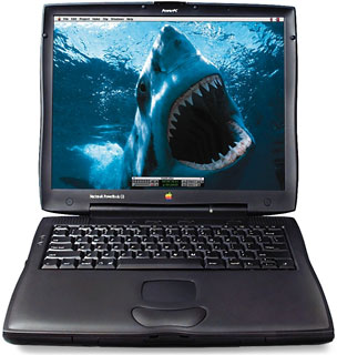 Where this becomes most important is on the LCD display. Anyone who has seen the PowerBook G3 Series with its incredible 1024 x 768 14.1″ screen has seen the future of computer displays. As LCDs drop in price, they will eventually replace the bulky, heavy, high power consumption CRT monitors that we’ve used for over 20 years.
Apple has drivers to let the 1024 x 768 screen emulate 640 x 480 and 800 x 600 screens, but the results at those settings leave a bit to be desired. Mapping either setting to the higher resolution screen involves some very messy math, since no setting is a comfortable multiple of the other. (512 x 384 would be, but I digress.)
Beyond that, LCD screens are getting sharper. IBM already has 150 dpi displays and is moving toward 200 dots per inch. More dots per inch give us other options.
On the one hand, let’s say we need a screen that can emulate current resolutions, but with less messy math than the 1024 x 768 screen. (How messy? 640 goes into 1024 1.6 times. So three of every five dots map to two pixels, the others to one, or you average things out on the fly an lose sharpness. 800 goes into 1024 1.28 times, which is even messier.)
What if the screen were 1920 x 1440. Each 640 x 480 pixel would map three pixels high and three across. No mess math at all! A 1280 x 960 display would map every other pixel as two, with the intervening ones taking one pixel. Again, very simple math. The 800 x 600 and 832 x 624 resolutions are still messy, but I think both would give way to 960 x 720, which comfortably maps each and every pixel to two on the screen.
But the entire WYSIWYG paradigm has to shift for this – and it can shift even further.
Microsoft, resurrecting a Woz idea from the Apple II, has developed a type display technology that uses individual red, green, and blue LCD pixels to display sharper text. Apple could go well beyond that.
Imagine if the OS would render anything that wasn’t bitmapped (Photoshop images, GIFs, and JPEGs are common bitmap formats) using the full resolution of the screen – whether that’s 1024 x 768, 1920 x 1440, or something completely different.
Hairlines in FreeHand would be pixel thin. Text would be as sharp as the screen allows, since the QuickDraw routines would know how to address individual screen pixels, not just the emulated 640 x 480 or 800 x 600 pixels they’d display bitmapped images at.
Suddenly you can read 8 point type without the compromises inherent in the 72 dpi paradigm Apple has so long embraced. Every bit of text would be as sharp as your screen was capable of displaying regardless of the resolution at which you chose to work.
Pipe dreams?
I don’t think so. Even with a fast computer, putting type on the screen takes a fair bit of overhead, especially with type smoothing (anti-aliasing) technology. But as the G3 goes past 300 MHz and the G4 approaches, the raw horsepower will be there to do this.
However, it requires thinking outside the box, shifting paradigms, or what Steve Jobs calls Thinking Different.
With LCDs set to replace conventional monitors over the next five years, someone has to do it. And whoever implements it first will have a clear advantage over the competition.
Read the follow-up: Resolution Independent Display.
* Since the article was written, it has become standard to refer to pixels per inch (ppi) rather than dots per inch (dpi) when referring to computer displays. This article reflects 1998 usage.
Update: It’s 2018, and I’m writing on a 21.5″ consumer iMac with a 1920 x 1080 pixel display. I have been using LCD screens instead of CRTs for so long that I don’t even thing about multiscan displays unless I’m writing about the old CRT iMacs and eMacs.
But this 2010 iMac is yesterday’s news. The 27″ iMac was introduced in 2009 with mind-blowing 2560 x 1440 pixels on its display. Apple followed up with an even higher resolution display in 2014 – the 27″ iMac with 5K Retina Display – 5120 x 2880 pixels at 218 ppi. And on the low-end, the 21.5″ iMac with 4K Retina Display shows 4096 x 2304 pixels arrived in 2015. (Apple still offers a “regular resolution” 21.5″ iMac, but the 27-incher is Retina only.)
Macs have been dual-processor or better for years, starting with Mystic Power Mac G4 in 2000 and becoming standard on the least expensive Mac in late 2006. With Mac OS X, Apple gave us very robust multi-user support. The paradigms have certainly changed since this article was first published in December 1998.
