Mac Musings
Fuzzy Retina Fonts: How Bad Are They?
Daniel Knight - 2012.08.23 -
There's no denying that a Retina Display is a beautiful thing with its individual pixels virtually indiscernible by the human eye at normal working distances. This was especially true when it came to the iPhone 4 in 2010 and equally true when the New iPad arrived earlier this year.
However, it's not quite so true for those using the 15" MacBook Pro with Retina Display. While OS X itself is gorgeous and all of Apple's apps take full advantage of the higher resolution of the screen, most third-party apps were not prepared for the Retina Display, and only a small percentage of them have yet been updated to take advantage of it.
Retina MacBook Pro (rMBP) users have been complaining about the way text is rendered in apps such as Microsoft Office and Adobe Creative Suite. But for those of us with regular displays, we really don't fully understand all the fuss over "fuzzy" text.
Thanks to Aaron Pressman's Gravitational Pull blog, we finally have some good examples of how well Apple's software renders fonts - and how poorly two popular apps do. You can see the full resolution 2560 x 1600 image in Aaron's recent blog entry, and I've taken the time to distill it to its essence in the following image:
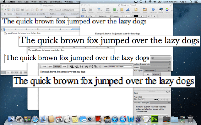
The original screen capture was reduced to 1280 x 800, tweaked with application of Photoshop's unsharp mask, then reduced to 640 x 400 and "unsharped" again. It's really only there as a reference. I deliberately did not create this as a Retina resolution image, and I saved it as a PNG image to keep it sharp and avoid the artifacts that JPEGs can introduce due to compression.
I then went back to the full resolution image and copied each line of text at normal resolution (twice as large as it would otherwise appear) so you can see the difference - and I think you'll agree that it's pretty dramatic.
From top to bottom, the text examples are from Microsoft Word, Pages, TextEdit, and Adobe Dreamweaver. Text in Pages and TextEdit is drop dead gorgeous, the kind of thing that gets the Retina Display its rave reviews.
Text in Word and Dreamweaver, not so much. Where the text in Apple's apps is crisp with almost no color fringing, the same sentence in Word and Dreamweaver is pixelated, has color fringing, and looks like crap - and many online articles are using much stronger language than that!
The best comparison I can come up with is an old one. The Macintosh LC was designed as a low-cost color Mac for the home and education market, and at the standard 640 x 480 resolution of a color display in those days, it had only 16-bit color unless you upgraded video memory. If you were using an LC with Adobe Type Manager or a TrueType font at a non-standard size such as 13 points, it would look a lot like the Word and Dreamweaver examples.
What surprises me the most is that the Word, Pages, and TextEdit examples are all using the same typeface, Baskerville, yet rendering it so differently. (The Dreamweaver example doesn't identify a font, but it looks more like Times than Baskerville.) I can't imagine working with either Word or Dreamweaver - and by extension Microsoft Office and Adobe Creative Suite - on a Retina Display MacBook Pro.
Adobe is working on Retina resolution versions of its Mac apps, showed off a work-in-progress version when the rMBP was introduced, and has given no clue as to when it will be available. Will it be an update to the current Creative Suite, or will Retina users have to wait for the next release of Creative Suite?
Worse yet, Microsoft has stated that it will not fix this issue in the current versions of its software. That's right, Microsoft is forcing those who buy the notebook with the most technologically advanced display on the market to put up with crappy fonts. And at this point it looks like it's going to make them wait until Microsoft Office for Mac 2013 (or 2014 or 2015) to get the kind of crisp display every Mac with a normal resolution screen already has and every rMBP already has with Apple software and dozens of third-party apps.
Poor form, Microsoft. Apple's $20 Pages and free-with-OS X TextEdit look a whole lot better than your $140 professional word processing application. And Adobe, Pixelmator is already Retina ready, so you'd better get a move on.
Want to know which Mac software is ready for the Retina Display? Head over to RetinaMacApps.com for the list. At present, the site shows over 150 Retina ready apps. When will Microsoft and Adobe join them?
That future is fuzzy.
Join us on Facebook, follow us on Twitter or Google+, or subscribe to our RSS news feed
Dan Knight has been using Macs since 1986, sold Macs for several years, supported them for many more years, and has been publishing Low End Mac since April 1997. If you find Dan's articles helpful, please consider making a donation to his tip jar.
Links for the Day
- Mac of the Day: PowerBook 500 Series, introduced 1994.05.16. 'Blackbird' includes a 25 to 33 MHz 68040 along with smart batteries and grayscale or color displays.
- Support Low End Mac