Mac Musings
Fulfilling the Promise of Aqua and the Quartz Rendering Engine
Daniel Knight - 2003.01.27
The classic Mac OS was brilliantly minimal. Icons were compact, text was precisely legible, menu bars were just the right size. System 7 added color to the mix, and the platinum appearance smoothed out some of the starkness left over from the Mac's 1-bit black-and-white era.
Apple could have made slightly better use of screen space by making the scroll bars maybe 4 pixels narrower and trimming the menu bar and window headers by a couple pixels, but overall the classic Mac OS made excellent use of the limited space on the original 512 x 342 pixel compact Mac screens - and the larger displays that were to follow.
Aqua
A lot of things changed with Mac OS X. The Aqua interface is visually attractive, processor intensive, and is sometimes more space efficient than the classic Mac OS - and often less so. The menu bar and windows headers, for instance, seem to be the same size as before. The scroll bars appear to be slightly narrower, making better use of screen space.
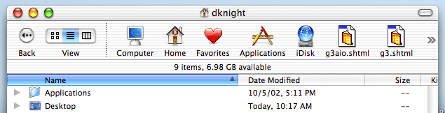
But Finder windows are also cluttered by things like the Computer, Home, Applications, and Favorites icons in the Toolbar - except for the Applications icon, I'd never used any of these until I started writing this article. I guess it's time I stopped just using Jaguar and read a book about it. Maybe then I'll find out why some site pages also appear up there.
Aqua really is beautiful, but do these icons have to be so large? Why can I only choose between this size of icon and no icons at all - why not a smaller set of icons?
I've done some fiddling with type and icon size. I find 11 point type is both easy on the eyes and relatively compact - although with the classic Mac OS, the same could be said of 9 point fonts such as Geneva. And regardless of how small a font I choose in my view, those gorgeous icons showing folders, the desktop, etc. stay the same size, so I can't actually see more items in the window.
Overall, Mac OS X cries out for a much larger display than the 512 x 384 or 640 x 480 screens of early Macs. Under OS X, an 800 x 600 display seems crowded, and 1024 x 768 seems to be the least resolution you want to really work comfortably.
Fluid Means Change
A key concept behind Aqua is fluidity. You can resize the dock, desktop icons, and Finder icons very fluidly. Then there's also the processor intensive stuff like shading, pulsating buttons, bouncing dock icons, and 3D buttons.
If I can change the size of icons some places, why can't I change them at the top of the Finder windows or when I view items as a list? Why are some icons fluid and others fixed?
If Aqua is really so fluid, why don't all of Apple's application programs take full advantage of it? For instance, instead of simply making text one step larger or smaller with a button in Safari, why not give us a slider that lets us dynamically change the displayed font size on the fly? That's something no other browser on the planet has (as far as I know).
How about the same kind of thing in AppleWorks instead of the discrete 50%, 66.7%, 100%, 200%, and other settings? Sure, leave the standards in place, but why not add a slider that lets us zoom in or pull back fluidly in real time?
The dock does it. The Finder does it. The technology is already there in the Quartz rendering engine. Apple ought to tap into it in other areas as well.
Considering how many websites have too small text, Safari would be a great place to add this, especially as it's a beta where we expect to see innovative improvements. (Has anyone ever run across one where the text is too large? Why is it that nobody seems to make their text larger than your default size, but so many want to make it smaller - and sometimes so small that you can't read it?)
Ditto for Mail, a program I really have not taken a liking to at all yet. I received one email in a small display typeface that was almost impossible to read. If Mail has a way to increase the size of type in a received message, I certainly couldn't find it.
- UPDATE: Several readers told me where to find it. It's not under application preferences - that would make too much sense. You can add Bigger and Smaller buttons and choose smaller icons by going to the View menu, selecting Customize Toolbar..., and then making your changes. Odd that you set your fonts as a preference, but not the interface. And Apple used to be so into interface conventions.... dk
If we're going to have a processor intensive interface anyhow, let's take full advantage of it and give Mac applications that fluidity as well. Let's see Apple take the brilliance of the Quartz display engine and run with it.
Maybe some day they'll even give us the option of selecting an interface as sparsely practical as we had with the classic Mac OS.