
Last week’s Low End Designer article was the most popular piece in the series so far. Clearly word processing is something that Low End Mac readers are interested in, but what about what happens with the text afterwards? This week, The Low End Designer looks a basic typography.
There Is a Lot More to Text than Just Typing
Stop. Read that again – there is a lot more to text than just typing. Yes, there is type layout, but there’s also more to that than one may think at first.
A crucial distinction is between typesetting and typography. Typesetting is, obviously enough, the act of setting type – getting it onto the page and doing it properly.
Typography is the art of choosing and arranging the styles of the type in order to create a readable and attractive display.
When it’s time to use your text, take a break first and look at other publications and printed products. In magazines and brochures, the dominant features are images and white space. In newspapers, the page is dominated by text, so it especially important to get this aspect correct.
Which typeface or typefaces to use is the most basic and most fundamental aspect of this. Many fonts have been designed specifically for publication use, so for serious design work it pays to do some research into type.
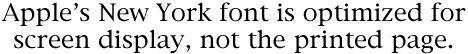
Try using the Mac’s New York typeface in print, and you’ll know exactly what I mean!
Sans Rien
Though there are many subcategories, the basic division in fonts is that of serif and sans-serif faces.
Serifs are small features at the end of strokes of letters, actually representing chisel marks. According to the Wikipedia, in Roman times, “Artisans would carve out a bit of extra space at the end of the long strokes of letters in order to prevent gravel and dust from collecting in the corners of the letters.”
Serif fonts are considered to be elegant, subdued, serious, and readable, and they are therefore commonly used to set large blocks of text – have a look at a novel or newspaper.
A sans-serif (or, less commonly, grotesque) font does not feature these details, and their modernist dynamic look sees them used largely for larger text items such as headlines or poster text (and relentlessly trendy art books).
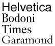 Ultimately it’s a matter of opinion. My personal preference is for sans-serif faces such as the Swiss font Helvetica or classic London Underground-inspired Gill Sans, but I wouldn’t want to live without serif fonts. Or, for that matter, slab-serif, blackletter, script, or any other type of font. The beauty of typography is in the choice – but be sure to make that choice and to stick to it.
One excellent font for body text, that is text of actual stories on a page, is a font called News 701. News is a serif font that is readable even at small sizes – perfect for newspapers, but other good serif faces include Bauer Bodoni, Times, and, controversially, Garamond.
Ultimately, the key to good font usage is simple: Choose as few as possible and stick to them. This will offer consistency and clarity to the reader.
Fitting In
Take a close look at a newspaper, and you will notice that, unlike many magazines and brochures, stories fit exactly into the allotted space with no white-space below the last line. This helps give a sober and professional feel to news pages, and you want to replicate that in your project, so what’s the trick behind this?
Well, subtly adjusting the kerning and tracking will get you some of the way there, but the only way to perfect it is to edit (or “sub”) the text and make it fit. This is one of the key reasons why publication pages are often laid-out by sub-editors and not designers: An understanding of the rules of language and how to make a story flow well will go a long way.
How to be Dashing
Good type is vitally important, not simply for clarity or aesthetics, but also because it exerts an influence on the orthographic structure of language – the set of rules that define how to write correctly. Bad typography has always been with us, particularly in advertising copy due to advertisers’ and designers’ total disregard for semantics, and it has caused massive confusion, but it’s been spreading from an unholy source.
Like many newspaper people, I am now going to blame the Internet:
Atrocious typography is on the commonplace on the Web due to two key factors: amateurism and poor type support in browsers.
Take, simply for example, hyphens and dashes. A hyphen (-) is a punctuation mark used to join words or separate syllables. Dashes are much more complex and include the figure dash, the minus sign, the en dash, em dash, and the quotation dash.
Of these, the en and em dashes are the most important. The en dash is one en in width, that is, the width of the capital N in the currently used font. The en dash is by definition exactly half the width of an em dash, which is defined as one em in width – the width of the capital M in any given font.
An en dash (&endash; in HTML and as used in this paragraph) is used to indicate a closed range (such as: George Orwell, 1903–1950) or a connection between two things of almost any kind, such as numbers, people, and places.
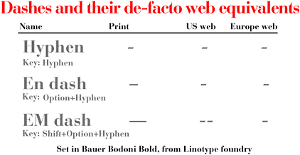
An em dash (&emdash; in HTML and as used in this paragraph) indicates a sudden break in thought—a parenthetical statement—or an open range (such as: Jason Walsh, 1978—).
Poor support for these features in browsers has caused the use of workarounds to become common practice.* In Europe, em dashes are commonly represented by a pair of spaces surrounding a single minus sign ( – ), while in the United States and Canada by a pair of spaces surrounding two minus signs ( — ). En dashes are generally replaced by a single minus sign on the Web.
* To support the widest range of browsers and keep file sizes a bit smaller, Low End Mac usually replaces en dashes with a single hyphen (minus sign) and em dashes with a hyphen surrounded by spaces. dk
In print, there is no reason not to use proper dashes – en, em or otherwise. The alternatives, while acceptable on the Internet, are beginning to be replicated in print, where they are by definition wholly unnecessary and nothing more than errors.
Typography is truly an art, something that designer and typographers have labored over for centuries. This simple introduction cannot do much more than scratch the surface of the subject, so if you want to learn more about type but don’t fancy going to art school, a few good books will go a long way.
Stop Stealing Sheep & Find Out How Type Works
Erik Spiekermann. Adobe press’ classic guide to understanding type. This book goes through the subject from beginning to end, offering a basic grounding in font usage and typography.
The Mac Is Not a Typewriter
Robin Williams. This book is a handy reference for anyone interested in page-layout. Topics covered: curled vs. generic quotation marks, en and em dashes, tabs and indents, kerning, leading, white space, widows and orphans, and hanging punctuation.
Designer’s Handbook
Alastair Campbell (out of print). This simple guidebook is getting on in years, but it will help you understand all of the jargon thrown at you by printers, from Pantone™ through bleed to trapping and beyond.
PREVIOUS: Kill Bill: 12 Alternatives to Microsoft Word
NEXT: Text and Typography: Leading, Kerning, Tracking, and Justification
Keywords: #typography #endash #emdash #serif #sansserif
Short link: http://goo.gl/aPh2pJ
searchword: serifsanddashes
